View all the winners!
With thousands of websites created in Snowfire and over 30 websites in the finals, the jury hasn't had an easy task. Below, the winner who swept the competition is presented, along with the top ten websites with the highest scores when all categories are combined. Check out the different categories and read the jury's verdict.
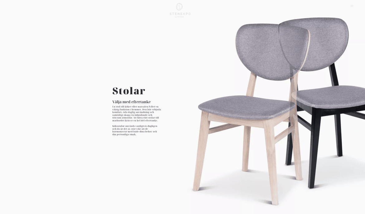
1. Stenexpo
Incredibly sleek and stylish design that flows harmoniously from the homepage to all subpages. It is also very user-friendly thanks to the sleek design and the structure over pages/subpages and CTA buttons. It is a unique style, and it is immediately evident that this website was created by a designer with an eye for brand profiling.
Check out the interview and peep the pics with the Svanbring brothers, the owners of Stenexpo
Jury's verdict
Nine designers from Sweden, Portugal, and Finland,
all members of the Designcommunity, evaluated the entries based on four criteria: Design Experience, Usability, Copywriting, and Target Group Adaptation. The jury was not allowed to vote on their own design or their own clients.
Top 10, 2023
1. Stenexpo
Incredibly sleek and stylish design that flows harmoniously from the homepage to all subpages. It is also very user-friendly thanks to the sleek design and the structure over pages/subpages and CTA buttons. It is a unique style, and it is immediately evident that this website was created by a designer with an eye for brand profiling.
Great pictures of the products, both neutral and in their environment. The page conveys the feeling of solid craftsmanship and quality.
Website: Stenexpo
Design: Becc Designstudio
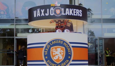
2. PopUpbar
A delightful narrative with the full visual toolkit. Good moving media that is at the same time distinctly descriptive and brand-building. Strong graphic identity that encompasses feelings of pub, sport, events, play, and stylish corporate branding. I have no trouble at all imagining my own company with a PopUp bar – rather, it's strange that I don't already have one.
Website: PopUpbar
Design: Becc Designstudio
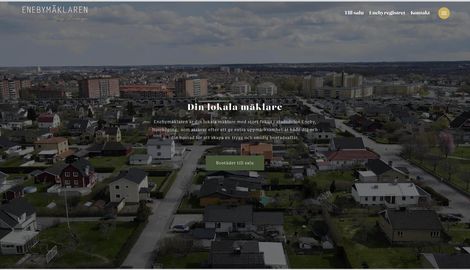
3. Enebymäklaren
A favorite among all submissions. Sleek design with warm colors that contribute to the personal feeling the entire website radiates. The approach feels directed to me as someone looking to buy or sell a property in the area.
Enebymäklaren comes across as a professional and at the same time personal real estate service that you can trust. The website is directly targeted at its audience and is user-friendly with a smooth page structure and sleek images.
Website: Enebymäklaren
Design: Beegleton
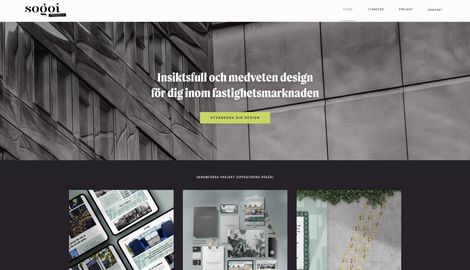
4. Sogoi
The website inspires trust. It is also so stylish. The designer knows their stuff and succeeds in talking about many levels of services in a fun way with beautiful matching fonts and great pictures. All colors and images play along with the message. It feels thoroughly crafted all the way.
Website: Sogoi
Design: Sofia Sandell
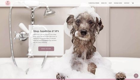
5. BK Hund
The picture of the dog at the start ensures that this page does not go unnoticed. Educational with pictures of different dog sizes. Good links, easy to click around with CTA in the right places. So easy to conjure up a well-functioning page - look at how much can be done with Snowfire. All the info is there, including the map.
Website: BK Hund
Design: Digital Guidance
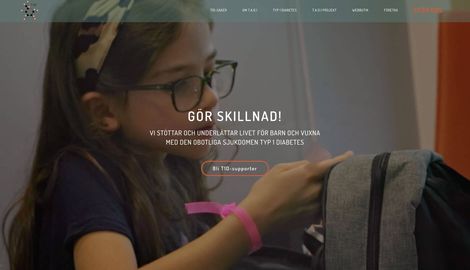
6. TAD 1
Wonderful, mischievous images and waveforms create a playfulness that lifts the entire page. The video at the start immediately captures interest, and you want to know more about how you can contribute. Straightforward and clear text, along with many good and clear CTAs, make it easy for a visitor to navigate the page.
Website: Together Against Diabetes 1
Design: Becc Designstudio
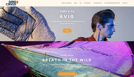
7. Dansistan
I like how the use of video at the start captures interest. It's exciting imagery and the graphics contribute to that. It makes you curious and want to continue, which is the sign of a good page. I like the way they use the images to make it interesting. Image and text create a whole that makes you curious about these forms of art.
Website: Dansistan
Design: In good company
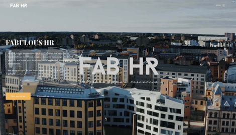
8. FAB HR
I like how FabHR has set up the web, and especially the start page. How they use video to highlight the company's identity and core values.
Video is fundamentally, of course, very strong as a visual medium, and in these clips, you get the feeling that they take care of each other in the way that one would want them to take care of the customer organisation. Trust is built, so to speak, from the inside. The colors are warm, and the typography/copy is cohesive.
Website: FAB HR
Design: Beegleton
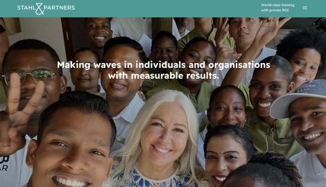
9. Stahl & Partners
Here they have succeeded in combining the international and professional aspects while maintaining a personal touch. The color palette makes the page interesting without overpowering it.
Short messages that provide a quick glance at what the company delivers, mixed with pictures of people, create clarity. Here, you meet people who make a difference, and you get measurable results.
Website: Stahl & Partners
Design: Digital Guidance
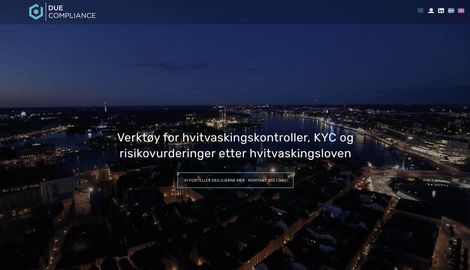
10. Due Compliance
It's challenging to create a dark page about money laundering ;). Here, they succeed in explaining complex systems in an accessible way. It's readable and interesting.
Nice films with Stockholm in the evening atmosphere. Bold image with the gentlemen on the couch - We know money laundering. Here, one takes a stand and knows what one can do.
Webbsida: Due Compliance
Design: Digital Guidance
Winners in the four categories
Usability
Enebymäklaren
A favorite among all submissions. Sleek design with warm colors that contribute to the personal feeling the entire website radiates. The approach feels directed to me as someone looking to buy or sell a property in the area.
Enebymäklaren comes across as a professional and at the same time personal real estate service that you can trust. The website is directly targeted at its audience and is user-friendly with a smooth page structure and sleek images.
Website: Enebymäklaren
Design: Beegleton
Copywriting
FAB HR
I like how FabHR has set up the web, and especially the start page. How they use video to highlight the company's identity and core values.
Video is fundamentally, of course, very strong as a visual medium, and in these clips, you get the feeling that they take care of each other in the way that one would want them to take care of the customer organisation. Trust is built, so to speak, from the inside. The colors are warm, and the typography/copy is cohesive.
Website: FAB HR
Design: Beegleton
Target group adaptation
BK Hund
The picture of the dog at the start ensures that this page does not go unnoticed. Educational with pictures of different dog sizes. Good links, easy to click around with CTA in the right places.
So easy to conjure up a well-functioning page - look at how much can be done with Snowfire. All the info is there, including the map.
Webbsida: BK Hund
Design: Digital Guidance
Design experience
Stenexpo
Incredibly sleek and stylish design that flows harmoniously from the homepage to all subpages.
It is also very user-friendly thanks to the sleek design and the structure over pages/subpages and CTA buttons. It is a unique style, and it is immediately evident that this website was created by a designer with an eye for brand profiling.
Great pictures of the products, both neutral and in their environment. The page conveys the feeling of solid craftsmanship and quality.
Website: Stenexpo
Design: Becc Designstudio
Snowfire Design Awards
The Snowfire Design Awards celebrate what designers, developers, and marketers create together. It's a seal of quality for our work in creating secure business hubs for entrepreneurs who want to attract more customers through their websites.
The 2023 Snowfire Design Awards have come to an end. Nominations for the 2024 awards will open in the fall. A big thank you to all customers and designers who submitted their entries.